Ane Devesa And José Agenjo
–
Ane Devesa and José Agenjo need no introduction. The interior designers have been making waves in the design field, and after presenting their one-of-a-kind exhibition at Casa Décor Madrid, we decided to talk with them to know more about their unique signature style and next projects!

YOU MAY ALSO LIKE:
Neutral Palette And Luxury Meet In This NYC Modern Apartment
Covet House x K.A Interior Design: Step Inside This Modern Classic
Inspirations Blog: Ane, you have a degree in Fine Arts and you have dedicated some years of work to painting, exhibiting your work in renowned galleries such as Jorge Alcolea and the European Museum of Modern Art. José, you also have a degree in Technical Architecture and in Commercial Management and Marketing. When did the desire to dedicate yourself to interior design arise? What are the main design names that inspire you?
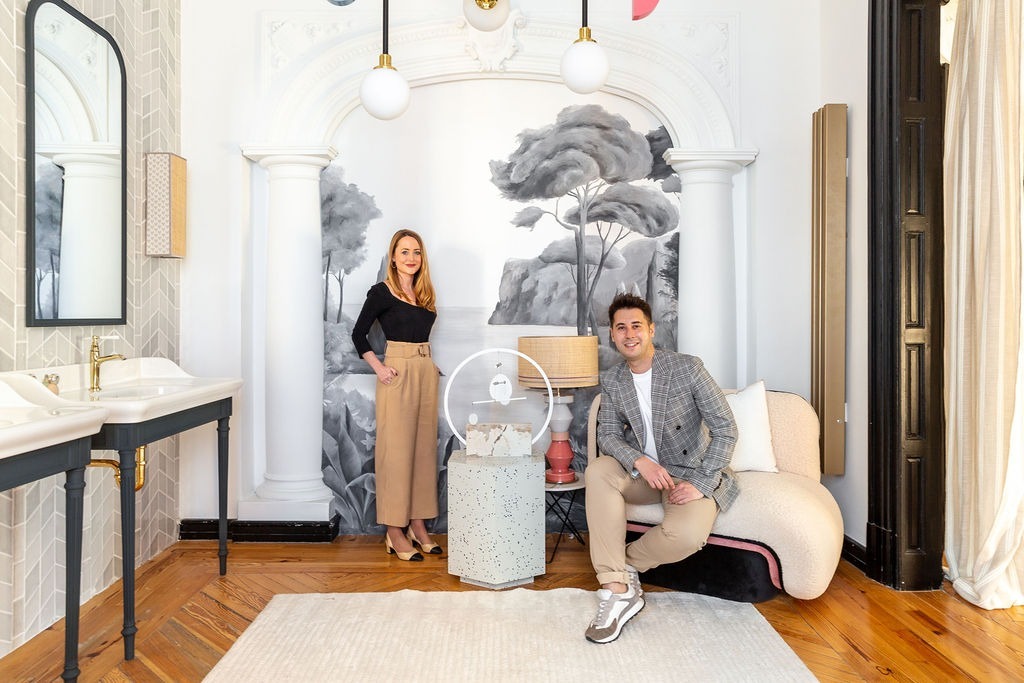
Ane Devesa and José Agenjo: We have always been attracted to this world as a specialization of our studies, for Ane art and design go hand in hand, proportions, color composition … and for José, technical detail combined with aesthetics. We are inspired by colleagues like Francesc Rife, Erico Navazo or Beatriz Silveira.

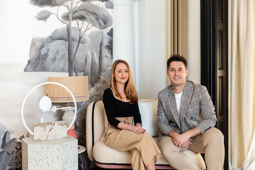
IB: You intend to create the perfect space for every moment of people’s lives, where quality and creativity are reflected in each of their works. What is it like to create a duo project? Do you always agree or disagreements arise along the way?
[BDCK category=3 Keywords=”CH-riyadhprojectch”][/BDCK]
A & J: In the vast majority of aspects we usually agree but there are always aspects that are debated, which end up being the most reinforced points of the project when it is executed. Additionally, each of us knows their strengths and we fully trust each other.
IB: What cannot be missing in a space, according to Devesa and Agenjo?
A &J: Some ceramic element and allusion to nature.
[BDCK category=3 Keywords=”CH-covetlightingbestsellers”][/BDCK]
IB: In your own opinion, what is the trend for next year in interior design?
A & J: The trend as a space will continue to be housing, although it will again give way to hotels, which will have a much more welcoming appearance to create that evocation and hence the color palette is much more neutral and calm.

IB: What was the first project you did together? And among those projects, which one would you classify as your favorite creation?
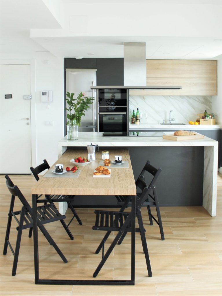
A & J: The first joint project was for a co-working, we created a kitchen in a petrol blue tone that would break the flatness of the room, being the new focal point. We could not say which is our favorite creation, but our participation in Casadecor 2020 was something very special on many levels.

IB: What would you like to do as interior designers that you haven’t done yet?
A & J: We are looking forward to creating a restaurant, it is something that we find exciting in all its aspects.

IB: Could you tell us a bit about the space you present at Casa Decor Madrid? In your opinion, what would be the biggest difference compared to the space you presented in the last edition?
A & J: This year we have designed the space for Jacob Delafon, a sanctuary where Cleo lives, a cosmopolitan, elegant and avant-garde girl. We conceive luxury as something warm and welcoming, for that reason we have used a palette of neutral tones and sand, noble materials such as wood and marble and of course ceramics, from traditional pottery, through small-format tiling and using advances offered by the large format. On the other hand, to create a sense of comfort, we have literally brought nature with olive trees, ceramic swallows and a mural painted by Ane that expands the room and evokes calm. Last but not least, the combination of different textiles and textures combined with photographs and the most sculptural furniture create a juxtaposition of planes that combine perfectly, transmitting that calm luxury that we defend so much.

The main difference is the type of space, in 2020 we had the determining factor of the catalogs and we had no natural light for that reason we worked a lot with artificial light and green and earth colors to generate sensations, in this edition we have left as the protagonist the original container and taking advantage of the wonderful light that we had, using a neutral palette that gave prominence to the very special pieces that we have.

[BDCK category=3 Keywords=”CH-capuchinsofa”][/BDCK]


